
Mobile App Design: Part 2
Understanding the 8pt grid system In this series I am going to be writing about designing for mobile applications based on the platform guidelines.
Mobile App Design: Part 2
Understanding the 8pt grid system

Glossary:
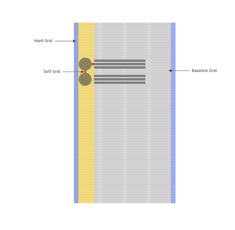
Grid:
A grid is a series of vertical and horizontal lines that are used to form the basis of a modular and systematic approach to the layout, ensuring visual consistency between elements.
Baseline grid:
The baseline grid is a series of invisible vertical units that can be used to create consistent vertical spacing between the elements.
Hard grid:
Placing elements into a system-displayed grid
Soft grid:
Placing elements in association with the individual elements
8-Point Grid:
Using multiples of 8 to define dimensions, padding, and margin of both block and inline elements. To put it simply any defined height or width, margin or padding will be an increment of 8.
Why 8 Point?
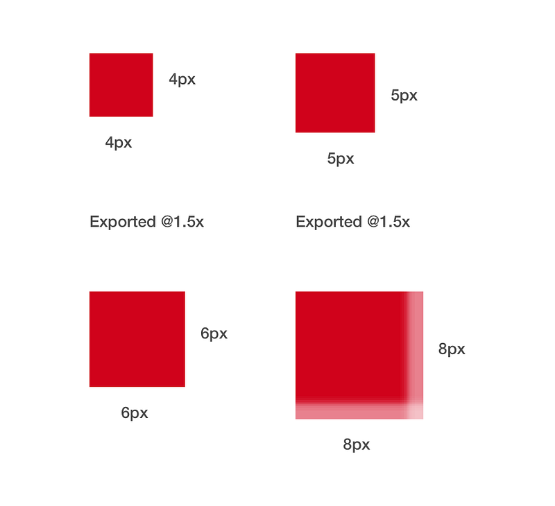
There are different types of devices with varying densities as we seen in the previous post. To generate assets and to maintain quality, consistency we need a system. The advantages of using 8 pt grid is,
- It is easy for devices to render even number than an odd number where it results in half pixel offset.
- Most of the common screen sizes are divisible by 8 making it the obvious choice.
- https://material.io/guidelines/layout/metrics-keylines.html#
Next in the series Mobile App Design: Part 3( Setting up the artboard)